http://www.mediafire.com/?t5cwp8g6e4xp6w2
http://www.mediafire.com/?3ypk3v9zkb2sfs4
http://www.mediafire.com/?xmo0qza62y7bphx
2011年10月24日星期一
2011年10月9日星期日


2011年9月26日星期一

2011年9月18日星期日
Week 7

Reference: http://en.wikipedia.org/wiki/New_Museum_of_Contemporary_Art (accessed on 17th, 9,2011)

interactive pdf : http://www.gamefront.com/files/20790986/sanna3.pdf


2011年8月21日星期日
2011年8月17日星期三


I.M. Pei poster

This poster has used a variety of different elements. The horizontal columns from top to bottom contain different fonts and colors for text as well as large and small size. The use of background color is also noticeable. The crystal blue sky is used as the background to establish a connection to the text "Learning from light" . There are two images in this poster, one is a face of I.M Pei, the other one is a building from him. They have perfectly conveyed the themes of this film which is about how I.M. Pei approach the designing of architectures. They are also very successful in terms of grabing some attention from the readers. Because you can see a physical building applied with lighting from light to dark which automatically lure the readers to find out more about I.M. Pei's ideas on how lighting involve in architecture. The text "THE VISION OF I.M. PEI" is also executed well in terms of its postioning and color. It is in white which make the text stands out and postioned at top rather than bottom emphasizes the importance. The text down below " a film by ..." establish a contrast with the white text above, delivering a message of which one is more important. Overall this is a good poster in a way the text, images are used.
2011年8月16日星期二
Reflection
My chosen designer was I.M. Pei, the entire design process of mine for this assignment was heavily influenced by his style. The first post required us to introduce the chosen designer, this is where i get to know a little about him. I think the week 2 independent stuides really helped me out a lot. Because we had to go to the library and gain futher information about another 3 examples of selected architec's work. It gave me an insight of what I.M. Pei is capable of and his style of designing.
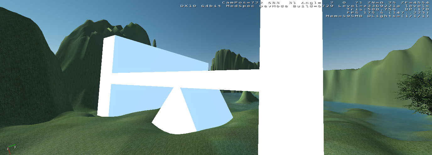
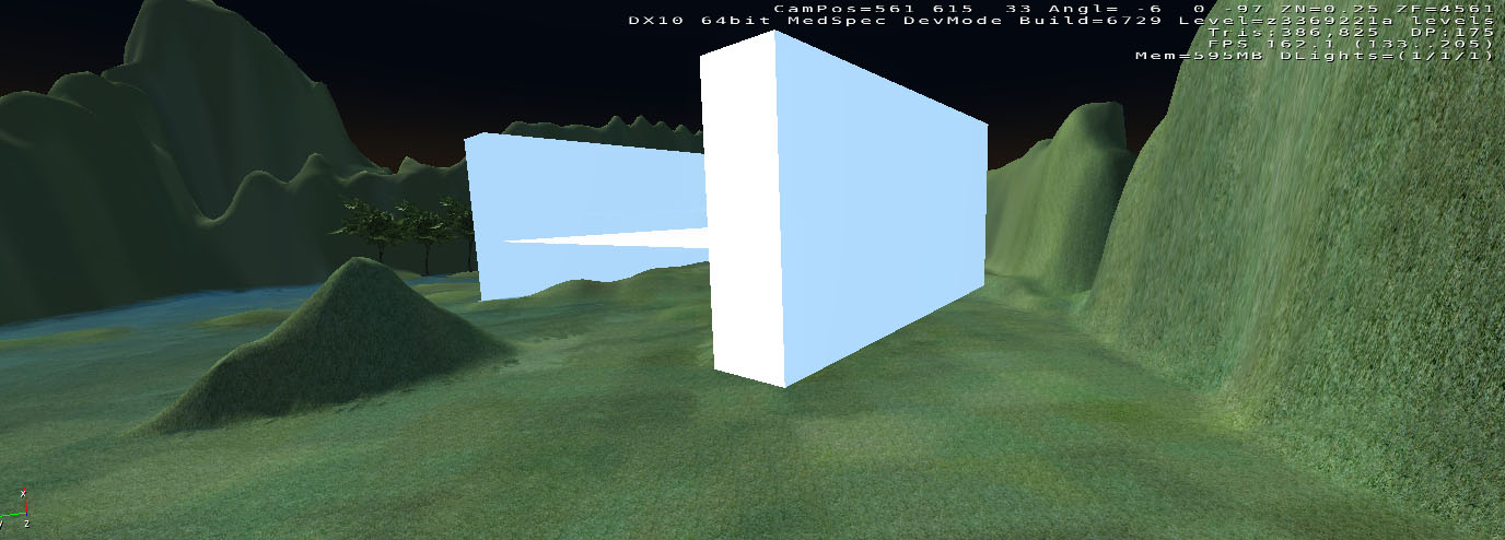
The first step was to create some paper folding and model them in 3dsmax, two of my foldings are both simple, one is inspired by the Luce Memorial Chapel which a simple shape of triangle. So I sort of did a M shape folding which can be perceived as two trangles sticking together. The other folding is inspired by Rock and Roll Hall of Fame which is another great example of the use of simple geometry such as circle, rectangle, cubist.
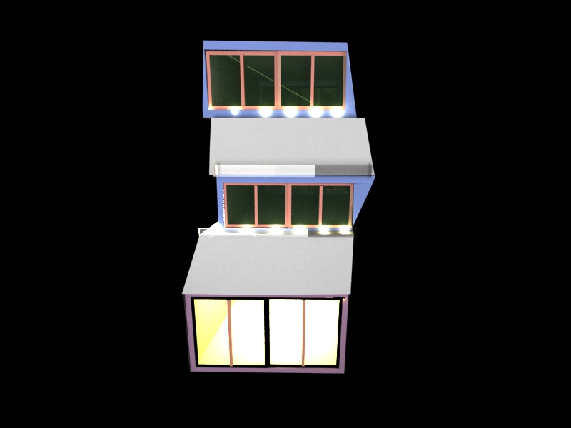
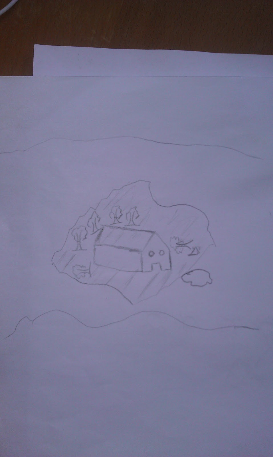
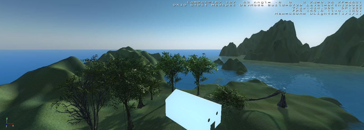
According to the week 2 independent studies, I made three developed spore creatures, first one realtes to national gallery of art, my thought was to make it physically look like the building, agian, the most important thing I applied to it was the use of different geometries. Second creature was inspired by Louvre Pyramid, because the building is largely constructed by triangular glass segments, therefore this creature has a solid structure in terms of its triangular shape. The last one was about balancing the symmetry according to Fragrant Hill hotel. The two enviroments that I made relate back to my paper foldings and especially the three develped creatures, once I have done these, it is not hard to combine them in an environment. I think I spent more time trying to resolve problems I encountered in crysis sandbox editor. For the final envrionment of mine, I listened to some advice from my tutor and made the model even more simple than before.
The first step was to create some paper folding and model them in 3dsmax, two of my foldings are both simple, one is inspired by the Luce Memorial Chapel which a simple shape of triangle. So I sort of did a M shape folding which can be perceived as two trangles sticking together. The other folding is inspired by Rock and Roll Hall of Fame which is another great example of the use of simple geometry such as circle, rectangle, cubist.
According to the week 2 independent studies, I made three developed spore creatures, first one realtes to national gallery of art, my thought was to make it physically look like the building, agian, the most important thing I applied to it was the use of different geometries. Second creature was inspired by Louvre Pyramid, because the building is largely constructed by triangular glass segments, therefore this creature has a solid structure in terms of its triangular shape. The last one was about balancing the symmetry according to Fragrant Hill hotel. The two enviroments that I made relate back to my paper foldings and especially the three develped creatures, once I have done these, it is not hard to combine them in an environment. I think I spent more time trying to resolve problems I encountered in crysis sandbox editor. For the final envrionment of mine, I listened to some advice from my tutor and made the model even more simple than before.


2011年8月15日星期一


2011年8月14日星期日


2011年8月7日星期日
Augmented Reality
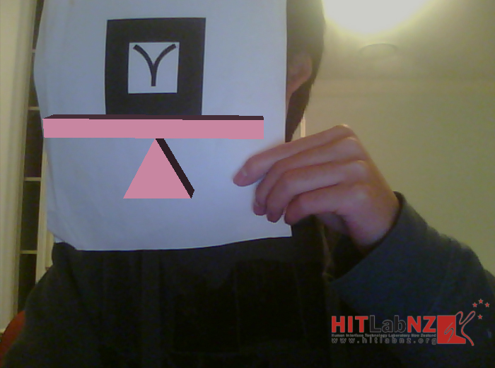
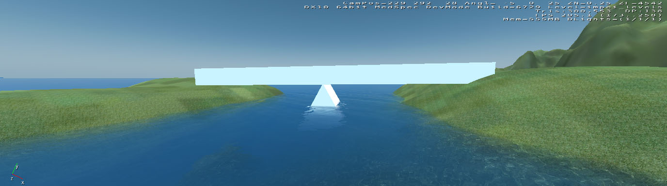
I found this video insipring as it is very similar to what we are doing in tutorials. With the aid of a piece of paper and buildAR, it allows us to generate a variety of different scenes.
2011年7月31日星期日


3 developed creatures

Gary: Inspired by the national gallery of art from I.M. Pei. According to my description to this building, the most important concept involved in designing the project comes down to geometric complexity. So for this creature, I tried a few polygons. The appearance of this creature is also similar to the front facade of the gallery.
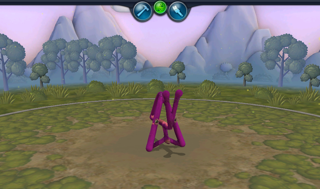

Pyra: Inspired by the Louvre Pyramid designed by I.M. Pei, because the building is largely constructed by triangular glass segments, therefore this creature has a solid structure in terms of its triangular shape.

Fiti: Inspired by the Fragrant Hill hotel from I.M. Pei, two ideas on my mind when I created this were: the balancing of symmetry and the relationship between the creature and nature. For the balancing of symmetry, I made the body to be shape of the word S. The reason that I added elements of plants to this creature is everything has a close relationship with nature in Chinese culture, which was considered by I.M. Pei when he designed the hotel, it is surrounded by lake, flowers and trees.
2011年7月26日星期二
Week 2 independent studies: 3 more examples of selected architect's work
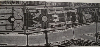
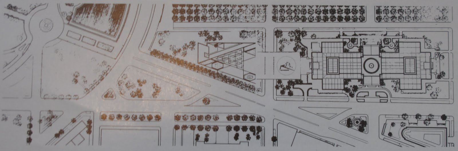
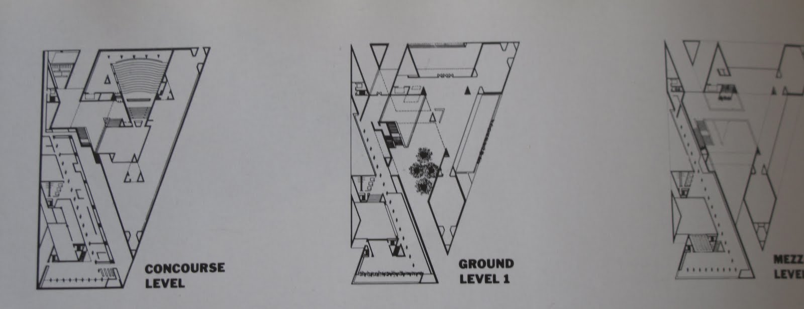
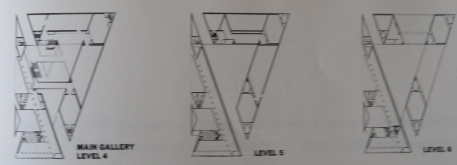
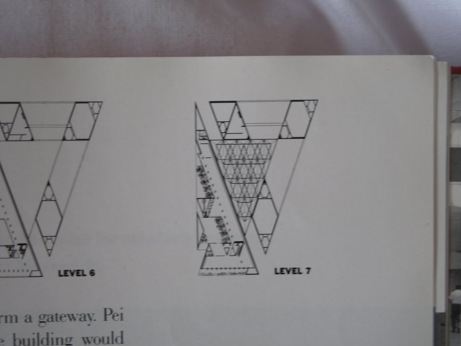
1. National gallery of art:
Details:
Location: National Mall in Washington,D.C.
Establishment: 1937
Building area: 1500 square metres
Visitor figures: 4.6 million (till 2009)
Scale: 7 stories
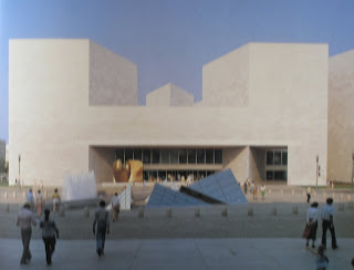


Description: The East Building remained Pei's most famous work. It will surely endure as one of his best. Here was the refinement he had felt unable to achieve in the detailing of the National Centre for Atmospheric Research, the massing of the Dallas City Hall, and the spaces of the Kennedy Library. It combined the best of his planning experience gained under Zeckendorf with the full fruits of the later years of experimentation in geometric complexity and the exploitation of materials. More than any of his previous buildings, it was also informed by an inescapably Chinese sensitivity to light and space and subtle control of how the user experiences a work of architecture. The building was at once monumental and animated, a mature expression of all the Pei had been moving toward as an architect.
References: I. M. Pei Wiseman, PQ 724.9, p. 155-156 (accessed 26 July, 2011)
http://en.wikipedia.org/wiki/National_Gallery_of_Art (accessed 26 July, 2011)
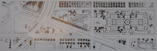
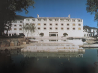
2. The Fragrant Hill Hotel
Details:
Location:In the former Imperial Hunting Grounds, 32km from downtown Beijing, China
Gross floor area: 36900 square metres
Construction: April, 1980
Completion: October, 1982


References: I. M. Pei Wiseman, PQ 724.9, p. 185-203 (accessed 26 July, 2011)
http://www.pcf-p.com/a/p/7905/s.html (accessed 26 July, 2011)
3. Louvre Pyramid
Details:
Location: The Louvre Palace, Paris
Completion: 1989
Height: 20.6 metres

Details:
Location: National Mall in Washington,D.C.
Establishment: 1937
Building area: 1500 square metres
Visitor figures: 4.6 million (till 2009)
Scale: 7 stories


Description: The East Building remained Pei's most famous work. It will surely endure as one of his best. Here was the refinement he had felt unable to achieve in the detailing of the National Centre for Atmospheric Research, the massing of the Dallas City Hall, and the spaces of the Kennedy Library. It combined the best of his planning experience gained under Zeckendorf with the full fruits of the later years of experimentation in geometric complexity and the exploitation of materials. More than any of his previous buildings, it was also informed by an inescapably Chinese sensitivity to light and space and subtle control of how the user experiences a work of architecture. The building was at once monumental and animated, a mature expression of all the Pei had been moving toward as an architect.
References: I. M. Pei Wiseman, PQ 724.9, p. 155-156 (accessed 26 July, 2011)
http://en.wikipedia.org/wiki/National_Gallery_of_Art (accessed 26 July, 2011)
2. The Fragrant Hill Hotel
Details:
Location:In the former Imperial Hunting Grounds, 32km from downtown Beijing, China
Gross floor area: 36900 square metres
Construction: April, 1980
Completion: October, 1982


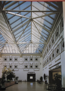
Description: This hotel stands in a public park within the former Imperial Hunting Grounds outside Beijing, not far from the Summer Palace and other key historic sites. Balancing symmetry and asymmetry, the 325 guest rooms zigzag out from a central skylit space to preserve the site's ancient trees. Each guest room opens onto a courtyard through a shaped "window picture" that frames the landscape and brings the outdoors inside. Building and gardens merge inseparably in an intimate reciprocal relationship.
Underlying the design is a strategy to provide a "Third Way" wherein advanced Western technology is grafted onto the essence of Chinese vernacular architecture without literal imitation. The skylight was the only major imported component; everything else was constructed by local craftsmen using age-old techniques and materials. Fragrant Hill thus draws from the living roots of tradition to sow the seed of a new, distinctly Chinese form of modern architecture that can be adapted, not merely adopted, for diverse building types. References: I. M. Pei Wiseman, PQ 724.9, p. 185-203 (accessed 26 July, 2011)
http://www.pcf-p.com/a/p/7905/s.html (accessed 26 July, 2011)
3. Louvre Pyramid
Details:
Location: The Louvre Palace, Paris
Completion: 1989
Height: 20.6 metres


订阅:
博文 (Atom)